Responses and Answers
In reVISit, a component typically has a response that is recorded when a participant completes a task. Responses can be provided via form elements or via some other kind of payload through your custom component and a ReactiveResponse.
Responses can optionally also be provided with an Answer that captures what the correct response is. This answer is used in several ways:
- If an answer is present, the data export will include data for the task that lists True and False for each response.
- In the analysis interface, tasks will be shown as correct or incorrect depending on the answer.
- Answers can be used to check the response during the experiment, which is useful for training.
Understanding Response Status
When a component does not configure correctAnswer, reVISit cannot evaluate whether a submitted response is correct. In sidebars and the Analyst task timeline, that response is shown with a gray checkmark and the tooltip “Response recorded; correctness not configured.” The gray checkmark confirms that the response was recorded; it does not indicate a correct answer. A green checkmark indicates a correct answer, and a red X indicates an incorrect answer.
There might be situations when answers cannot accurately capture whether a response was correct or not (e.g., with text input). In other situations, answers may have "degrees of correctness". In such cases, you will have to compute correct answers as part of your data analysis process.
Specifying Answers and Trainings
When you develop an online study, it's often important to train participants well before they can take a study. Typically, you want to give them an example task, but also provide help and hints at first. Here we lay out possibilities to develop trainings in reVISit leveraging responses and answers.
For a working example, refer to the demo and the associated config.
Here's a simple dropdown component asking what the most efficient visual mark is. The correctAnswer field contains an answer for the q-mark-type response that specifies that the correct answer is Bar.
"simple-dropbox": {
  "type": "questionnaire",
  "response": [
    {
      "id": "q-mark-type",
      "type": "dropdown",
      "required": true,
      "prompt": "What is the most efficient visual mark?",
      "secondaryText": "Hint: it's not round.",
      "placeholder": "Choose mark",
      "options": [
        "Bar",
        "Bubble",
        "Pie",
        "Stacked Bar"
      ]
    }
  ],
  "correctAnswer": [
    {
      "id": "q-mark-type",
      "answer": "Bar"
    }
  ],
  "provideFeedback": true,
  "allowFailedTraining": false,
  "trainingAttempts": 4
}
The last three lines specify that this is used for training:
The provideFeedback field adds a "Check Answer" button to the UI, which can be used to validate the answer based on the provided correct answer.
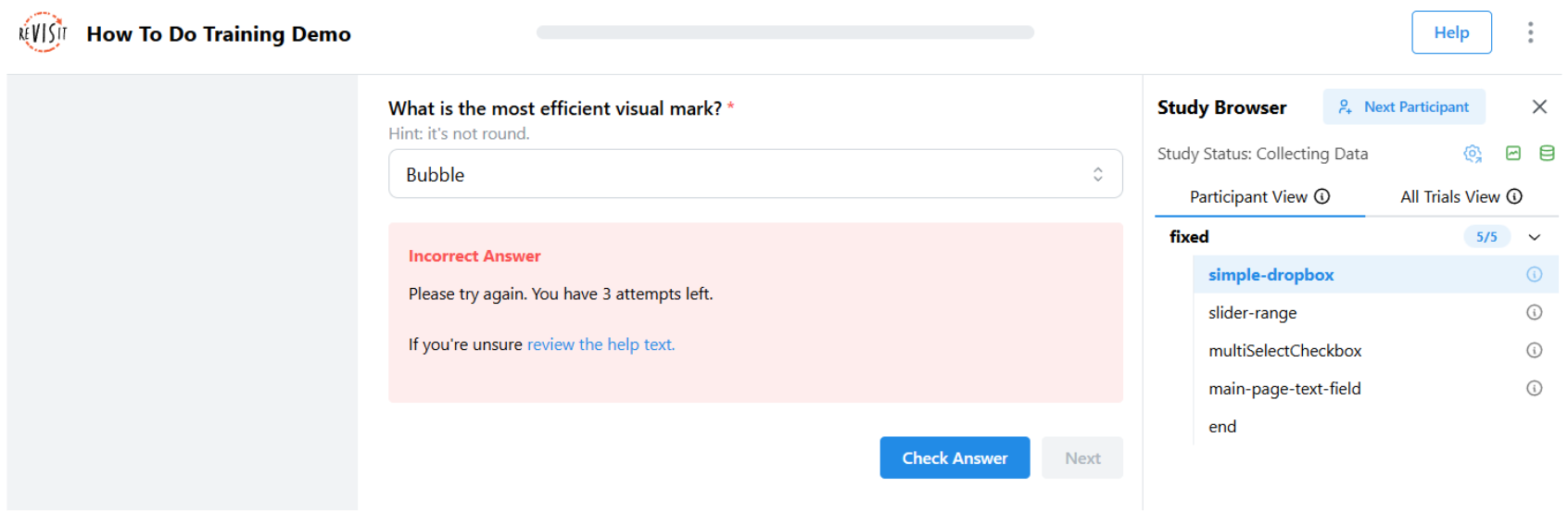
The above screenshot shows an example for when the response was incorrect.
Optionally, you can specify that trainings have to be successfully completed with the allowFailedTraining flag. You can specify the number of attempts with the trainingAttempts field. When failing is not allowed and the participant exceeds the number of failed attempts, the study will terminate.
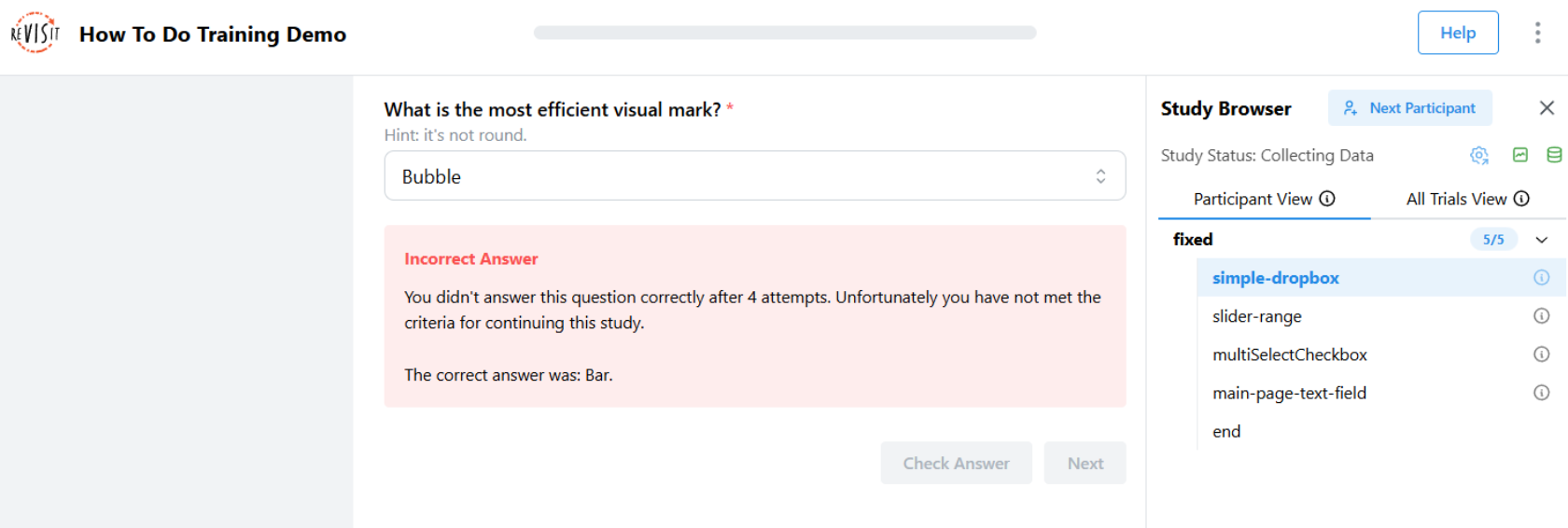 If a user fails the training and
 allowFailedTraining is set to false, they’ll automatically be marked as rejected. After a 5-second delay, they’ll be taken to a "Training Failed" page that informs them that they didn’t meet the training requirements and cannot continue with the study.
Navigation Buttons
You can customize the behavior and appearance of navigation buttons in your study components. These options can be set globally in the uiConfig or overridden on individual components.
Alignment
Use nextButtonAlignment to align the navigation action group—Previous, Check Answer, and Next—at the left, center, or right of its current location. The default is "right". This setting changes only the group's alignment; it does not change the order, location, or behavior of the buttons.
Set it in uiConfig to use the same alignment throughout the study. Set it on an individual component to override the global value for that component. Study Config validation accepts only "left", "center", and "right".
{
  "uiConfig": {
    "nextButtonAlignment": "center"
  },
  "components": {
    "consent": {
      "type": "questionnaire",
      "nextButtonAlignment": "left",
      "response": []
    }
  }
}
Next
The next button offers several customization options. You can change the button text using nextButtonText (e.g., "Continue", "Next Question") and control its location with nextButtonLocation.
To enable keyboard navigation, set nextOnEnter to true, which allows participants to press Enter to move to the next question. In a training component where Check Answer is available, Enter checks the answer first; otherwise, it moves to the next question.
For timing control, you can use nextButtonEnableTime to delay when the button becomes clickable, which helps ensure participants have time to read the content, and nextButtonDisableTime to set a time limit after which the button becomes disabled, which is useful for time-limited tasks.
You can also combine nextButtonDisableTime with timeoutReject to automatically reject participants who do not click the next button within the time limit. This setup is useful for enforcing strict time constraints in tasks or training phases.
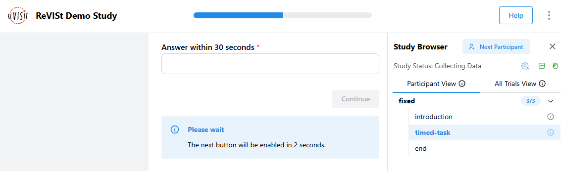
"uiConfig": {
  ...
  "timeoutReject": true
},
"components": {
  "timed-task": {
    "type": "questionnaire",
    "nextButtonText": "Continue",
    "nextOnEnter": true,
    "nextButtonEnableTime": 2000,
    "nextButtonDisableTime": 30000,
    "response": [
      {
        "id": "q1",
        "prompt": "Answer within 30 seconds",
        "type": "shortText"
      }
    ]
  }
}
Automatically Advance After a Timeout
To move a Participant to the next component after a time limit, set nextButtonAutoAdvanceTime on an individual component. You can also set these fields in a baseComponents entry and inherit them in components that use that base component.
{
  "components": {
    "timed-task": {
      "type": "questionnaire",
      "nextButtonAutoAdvanceTime": 60000,
      "nextButtonAutoAdvanceWarningTime": 10000,
      "nextButtonAutoAdvanceWarningMessage": "Moving on in {seconds} {unit}. Your response will not be saved.",
      "response": [
        {
          "id": "q1",
          "prompt": "Answer within one minute",
          "type": "shortText"
        }
      ]
    }
  }
}
nextButtonAutoAdvanceTimeis the required time limit, in milliseconds.nextButtonAutoAdvanceWarningTimecontrols when the warning appears before the time limit. It defaults to30000; set it to0or a negative number to hide the warning.nextButtonAutoAdvanceWarningMessageoptionally replaces the warning text.{seconds}becomes the rounded-up remaining time and{unit}becomessecondorseconds. When neither placeholder is included, ReVISit appends its standard countdown text.
The default warning says: “You will be automatically advanced to the next component. Responses on this component will not be saved.”
Unlike nextButtonDisableTime, this setting actively moves the Participant forward. It does not merely disable Next and does not reject the Participant.
When ReVISit auto-advances, it does not save the current component response. Use this only when intentionally discarding an incomplete response is acceptable. The stored component record includes its end time, timedOut: true, and an empty answer object.
Check Answer
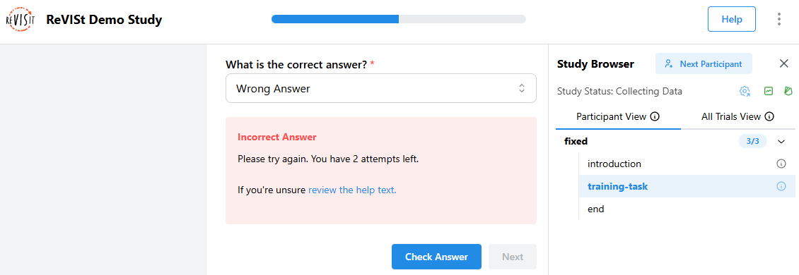
When you set correctAnswer and provideFeedback to true, a "Check Answer" button appears next to the Next button. Participants can click this button to see if their answer is right or wrong before moving on.
If a required or invalid response needs attention, Check Answer reveals the same validation errors as Next. This does not consume a training attempt.
The Check Answer button uses trainingAttempts to limit how many times participants can check their answer. When a participant gets the answer right, the Check Answer button turns off and the Next button turns on. If you set trainingAttempts to a number, the button turns off after that many tries.
Check Answer attempts and feedback status are saved, so refreshing the page does not reset a participant's attempts or feedback.
You can choose what happens when participants fail training by setting allowFailedTraining. When set to false, participants who use up all their tries without getting the answer right will be rejected from the study.
"components": {
  "training-task": {
    "type": "questionnaire",
    "provideFeedback": true,
    "trainingAttempts": 3,
    "allowFailedTraining": false,
    "correctAnswer": [
      {
        "id": "q1",
        "answer": "Correct Answer"
      }
    ],
    "response": [
      {
        "id": "q1",
        "prompt": "What is the correct answer?",
        "type": "dropdown",
        "options": ["Correct Answer", "Wrong Answer", "Another Wrong Answer"]
      }
    ]
  }
}
Previous
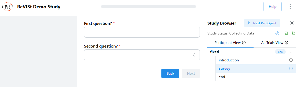
You can enable the previous button by setting previousButton to true, which lets participants move back through earlier parts of the study if needed. You can also customize the button text with previousButtonText.
"components": {
  "survey": {
    "type": "questionnaire",
    "previousButton": true,
    "previousButtonText": "Back",
    "response": [
      {
        "id": "q1",
        "prompt": "First question?",
        "type": "shortText"
      },
      {
        "id": "q2",
        "prompt": "Second question?",
        "type": "dropdown",
        "options": ["Option A", "Option B"]
      }
    ]
  }
}
You should only use the previous button with simple stimuli, like form elements, images, markdown, etc. If you have interactive components, use provenance tracking, use screen capture or audio capture, going back to a previous state will result in undesired behavior: all states, video, audio, will be overwritten.