Designing Forms
Form elements are essential for most studies to capture user responses. reVISit provides rich form elements, such as slides, check-boxes, text fields, etc, so that you can efficiently design your forms.
This tutorial does not give a comprehensive introduction into all form elements. For this, refer to the demo and the reference, shown below:
Instead, we introduce some high-level principles that apply to all form elements.
Principles
Form elements are components of type questionnaire. Here is a simple example with a drop-down element:
"components": {
    "survey": {
        "type": "questionnaire",
        "response": [
        {
            "id": "q-dropdown",
            "prompt": "Dropdown example – which chart do you like best?",
            "secondaryText": "You can specify secondary text to clarify your question.",
            "location": "aboveStimulus",
            "type": "dropdown",
            "placeholder": "Enter your preference",
            "options": [
                "Bar",
                "Bubble",
                "Pie",
                "Stacked Bar"
            ]
        }
        ]
    }
}
This renders like that:
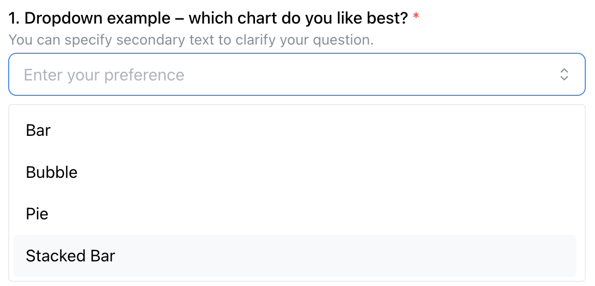
In this example, the drop-down is rendered in the main window, as indicated by the "location": "aboveStimulus" line. As documented in the BaseResponse, the other options are sidebar and belowStimulus.
Form elements can be placed either in a side-bar, or as the main content of a study page. The side-bar version is useful if you're showing another kind of stimulus in the main part of the window. The main page location is useful for stand-alone survey questions, or if you want to integrate your response with your stimulus.
Because form elements are so commonly combined with other stimuli, a standalone questionnaire component as shown above is just a stripped down component with “only” a response.
You can also add form-based responses to all other stimuli using exactly the same syntax!
Notable Features
Below we list some notable features that apply to all or most form elements.
Prompts and Descriptions
Each form element requires a prompt that introduces the question. You can also provide a more detailed description in secondaryText that is shown below the prompt; both are demonstrated in the above example.
Required Fields
You can make a field required, in which case a red star is rendered (see above) and it is necessary that a response is given before the “Next” button is activated and the participant can proceed. Required is the default, set "required": false if an answer is optional.
“Don't Know” Option
You can explicitly allow participants to state that they don't know the response with a dedicated checkbox:
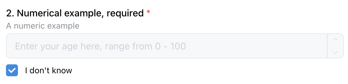
To achieve that, add the "withDontKnow": true option to your form element.
Dividers
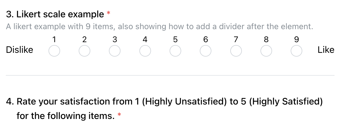
You can structure your forms by adding a divider between form elements. To add a divider, add "withDivider": true to the question that you want the divider to appear after. In the following figure, there's a divider added between question 3 and 4.
Radio and Checkbox Features
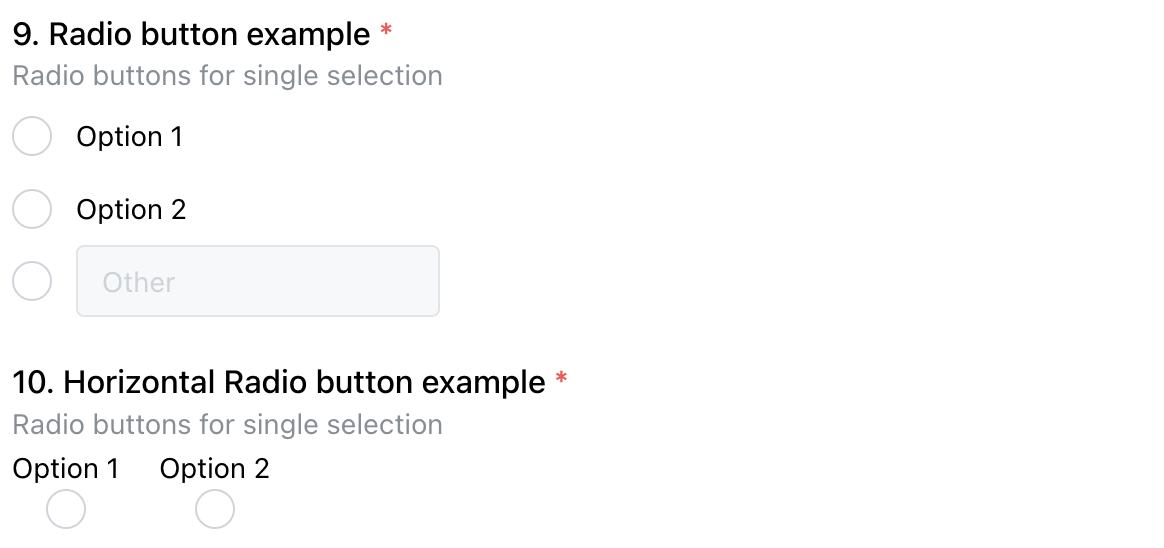
Radio buttons and checkboxes have some shared noteworthy features. Here is an example showing different configurations of radio buttons:
Vertical and Horizontal Layouts
Radios and check-boxes can be rendered either vertically (the default) or horizontally. The above figure shows radios for both. Set "horizontal": true to get the horizontal version.
“Other” Option
You can allow an “other” option for radios and checkboxes, as shown for the first radio group above. To enable that, set "withOther": true.