Data Export and Basic Analysis
reVISit allows you to export in Tidy format for analysis in Python notebooks or R.
Steps to Download Data
-
Navigate to the Analysis platform for the current study.
-
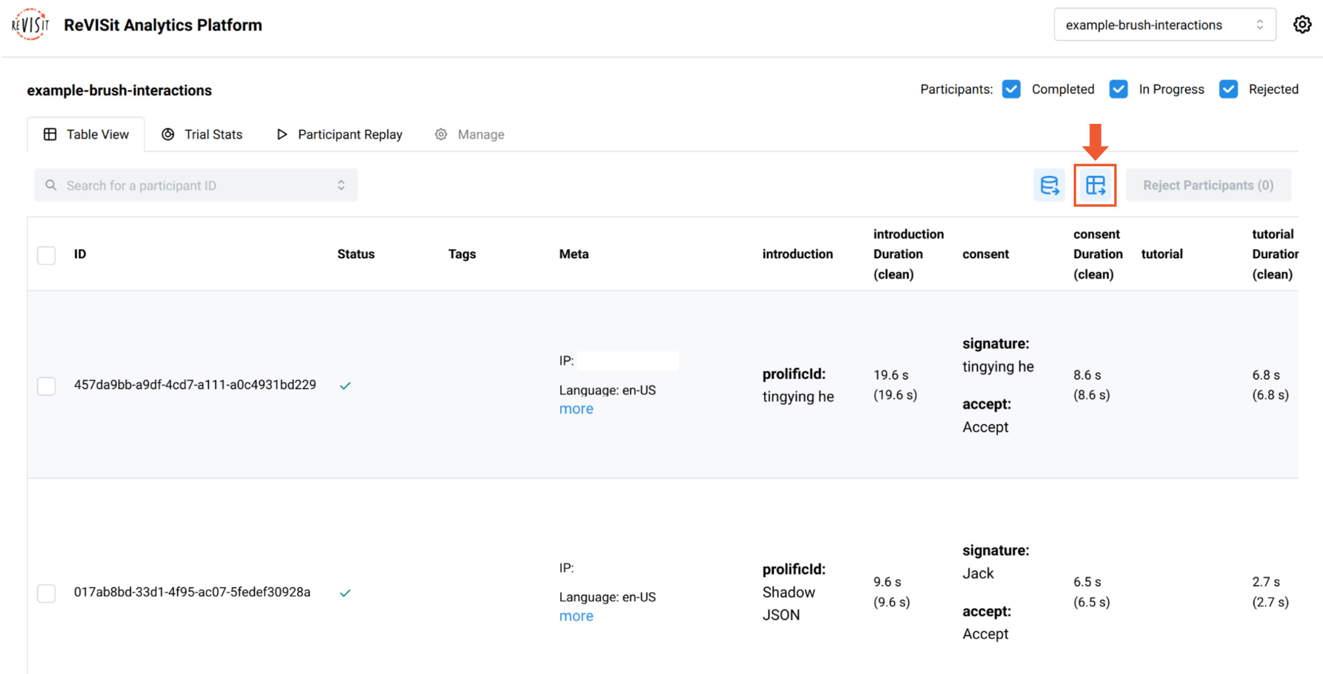
Open the Table View, then click on the Download all participants' data as a tidy CSV button. Here's a direct link for the example below.

-
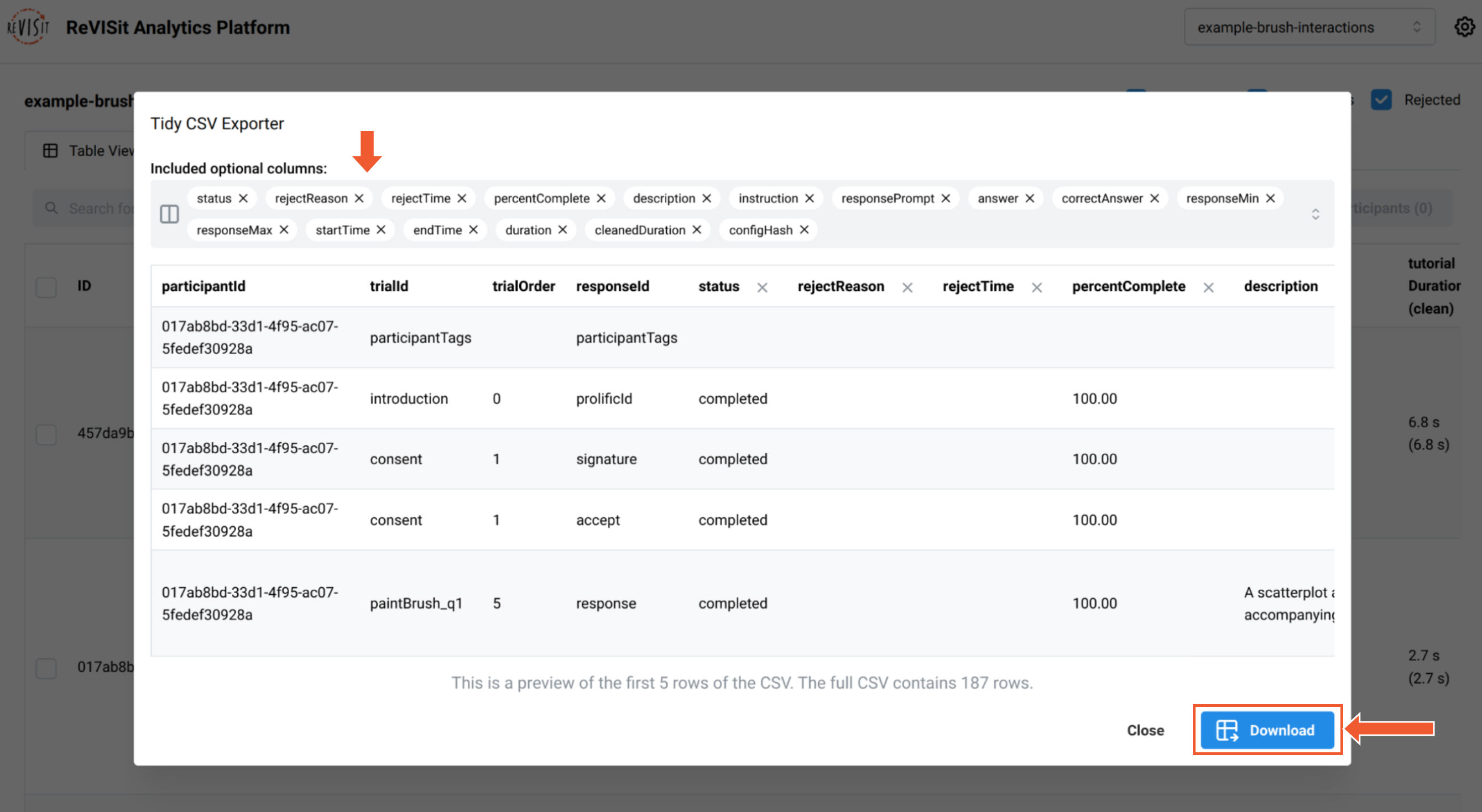
The CSV Explorer will open, where you can select the columns to export. A preview of the first five rows of the output CSV will be displayed.
-
Once ready, click the Download button at the bottom right.

After downloading the Tidy data, you can import it into your favorite analysis platform for further analysis. Below is an example of how to work with exported data from the Interactive Selections in Scatterplots study in R.
Example Workflow in R
1. Install Necessary Packages
list.of.packages <- c("ggplot2", "Hmisc")
new.packages <- list.of.packages[!(list.of.packages %in% installed.packages()[,"Package"])]
if(length(new.packages)) install.packages(new.packages)

library(ggplot2)
2. Read and Preview the Data
df <- read.csv("data/example-brush-interactions_all_tidy.csv")
head(df)
| participantId | trialId | trialOrder | responseId | |
|---|---|---|---|---|
| 1 | 017ab8bd-33d1-4f95-ac07-5fedef30928a | introduction | 0 | prolificId |
| 2 | 017ab8bd-33d1-4f95-ac07-5fedef30928a | consent | 1 | signature |
| 3 | 017ab8bd-33d1-4f95-ac07-5fedef30928a | consent | 1 | accept |
| 4 | 017ab8bd-33d1-4f95-ac07-5fedef30928a | paintBrush_q1 | 5 | response |
| 5 | 017ab8bd-33d1-4f95-ac07-5fedef30928a | paintBrush_q2 | 6 | max-response |
3. Filter Data for Task q2
q2 <- subset(df, grepl("_q2", trialId) & status == "completed")
q2$isCorrect <- ifelse(q2$answer == q2$correctAnswer, 1, 0)
q2 <- subset(df, grepl("_q2", trialId) & status == "completed")
q2$isCorrect <- ifelse(q2$answer == q2$correctAnswer, 1, 0)
4. Create a Violin Plot
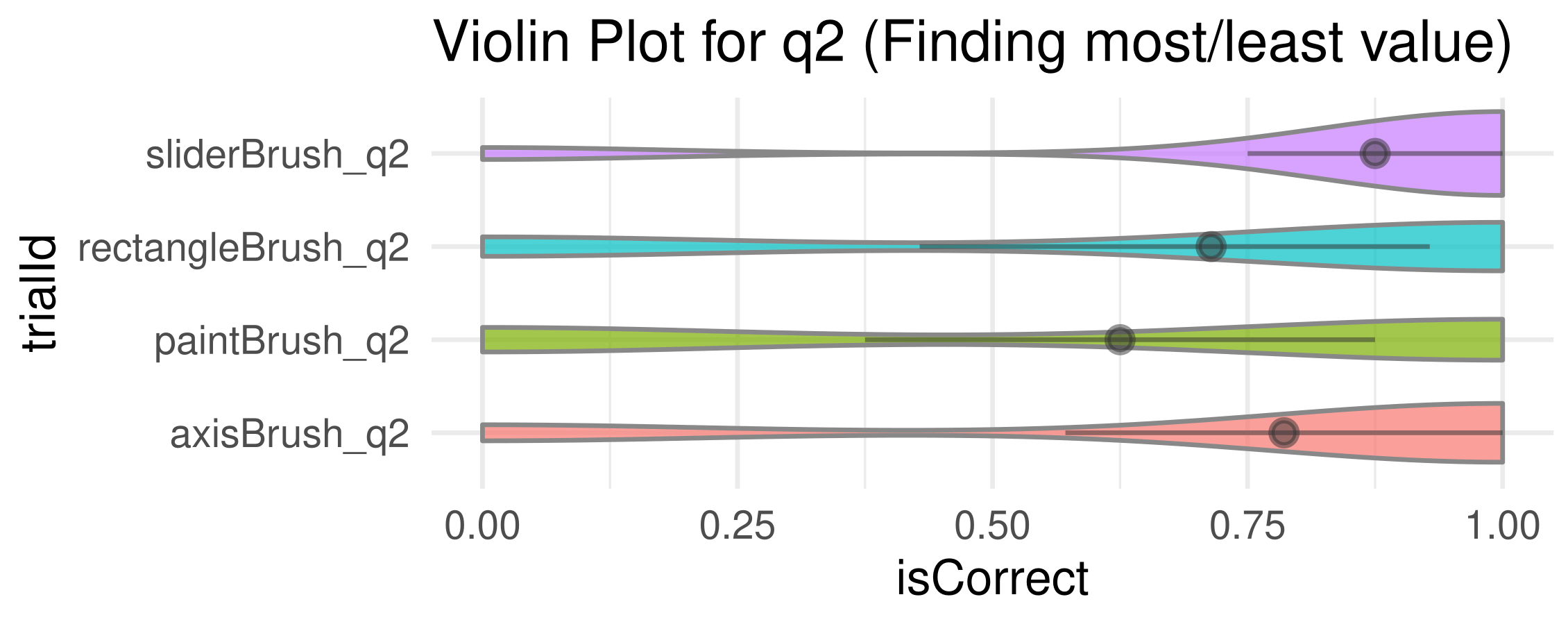
The plot displays correct answers on the right and incorrect answers on the left.
ggplot(q2, aes(x = isCorrect, y = trialId)) +
  geom_violin(aes(fill = trialId), color = "#888", alpha = 0.7) +
  stat_summary(fun.data = "mean_cl_boot", colour = "#333", size = 0.5, alpha=0.5) +
  theme_minimal() +
  theme(legend.position = "none") +
  labs(
    title = "Violin Plot for q2 (Finding most/least value)",
  )

We find accuracy using paint brush technique is much less than that of the others.
5. Export the generated plot.
ggsave("plot.pdf", width = 5, height = 2, units = "in")