Designing Forms
Form elements are essential for most studies to capture user responses. ReVISit provides rich form elements, such as sliders, checkboxes, text fields, etc., so that you can efficiently design your forms.
This tutorial does not give a comprehensive introduction into all form elements. For this, refer to the demo and other links in the relevant links panel. Instead, we introduce some high-level principles that apply to all form elements.
Principles
Form elements are components of type questionnaire. Here is a simple example with a drop-down element:
"components": {
  "survey": {
    "type": "questionnaire",
    "response": [
      {
        "id": "q-dropdown",
        "prompt": "Dropdown example – which chart do you like best?",
        "secondaryText": "You can specify secondary text to clarify your question.",
        "infoText": "Select the chart type you prefer from the dropdown menu.",
        "location": "aboveStimulus",
        "type": "dropdown",
        "placeholder": "Enter your preference",
        "options": [
          "Bar",
          "Bubble",
          "Pie",
          "Stacked Bar"
        ]
      }
    ]
  }
}
This renders like that:
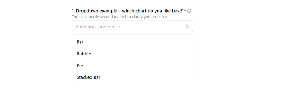
In this example, the drop-down is rendered in the main window, as indicated by the "location": "aboveStimulus" line. As documented in the BaseResponse, the other options are sidebar and belowStimulus.
Form elements can be placed either in a sidebar, or as the main content of a study page. The sidebar version is useful if you're showing another kind of stimulus in the main part of the window. The main page location is useful for stand-alone survey questions, or if you want to integrate your response with your stimulus.
Because form elements are so commonly combined with other stimuli, a standalone questionnaire component as shown above is just a stripped down component with "only" a response.
You can also add form-based responses to all other stimuli using exactly the same syntax!
Notable Features
Below we list some notable features that apply to all or most form elements.
Prompts and Descriptions
Each form element requires a prompt that introduces the question. You can also provide a more detailed description in secondaryText that is shown below the prompt; both are demonstrated in the above example.
Additional Descriptions
The infoText allows you to provide additional description for survey questions or response options that appears when participants hover over an information icon. This helps clarify questions or scales while keeping the prompt simple.
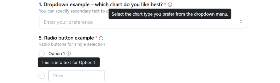
For response option, infoText is only supported in button, checkbox, radio, dropdown, matrix and ranking responses.
Required Fields
You can make a field required, in which case a red star is rendered (see above) and it is necessary that a response is given before the "Next" button is activated and the participant can proceed. Required is the default, set "required": false if an answer is optional.
You can also force participants to provide a specific answer value using requiredValue. This is useful for attention checks, training tasks, or ensuring participants read instructions carefully. The participant must provide an exact match with the specified value to proceed.
For single-select responses (radio, shortText, longText, numerical, etc.), requiredValue requires an exact match:
{
  "id": "accept",
  "prompt": "Do you consent to the study and wish to continue?",
  "requiredValue": "Accept",
  "location": "belowStimulus",
  "type": "radio",
  "options": [
    "Decline",
    "Accept"
  ]
}
For multi-select responses (checkbox, dropdown with multiple selections), requiredValue can be an array of values that must all be selected:
{
  "id": "multi-check",
  "prompt": "Please select both Option 1 and Option 2",
  "type": "checkbox",
  "options": ["Option 1", "Option 2", "Option 3"],
  "requiredValue": ["Option 1", "Option 2"]
}
When using requiredValue with arrays, the system checks that the participant has selected exactly the specified values, in any order. If the participant selects different values or a different number of values, they will see a message asking them to select the required options.
The requiredLabel property is similar to requiredValue but is more user-friendly. Instead of matching against the value stored in the data, it matches against the label displayed to participants. This is particularly useful when options have both labels and values, as it allows you to specify requirements using the human-readable label.
{
  "id": "attention-check",
  "prompt": "Please select 'I agree' to continue",
  "type": "radio",
  "options": [
    { "label": "I agree", "value": "agree" },
    { "label": "I disagree", "value": "disagree" }
  ],
  "requiredLabel": "I agree"
}
Default Values
Most form elements can include a default field to set an initial answer, which is shown when the question loads and restored if the participant resets the question instead of leaving it empty. If you use paramCapture to get a value from the URL, that value overrides the default.
{
  "id": "q-likert",
  "type": "likert",
  "prompt": "How difficult was this task?",
  "numItems": 5,
  "default": 3
}
For matrix questions, default sets a value for each row: use one string for matrix-radio, and for matrix-checkbox use a string (one choice) or a list of strings (multiple choices).
{
  "id": "matrix-default",
  "type": "matrix-checkbox",
  "prompt": "Which apply to each item?",
  "questionOptions": ["Q1", "Q2"],
  "answerOptions": ["A", "B"],
  "default": {
    "Q1": ["A", "B"],
    "Q2": "A"
  }
}
"Don't Know" Option
You can explicitly allow participants to state that they don't know the response with a dedicated checkbox:

To achieve that, add the "withDontKnow": true option to your form element.
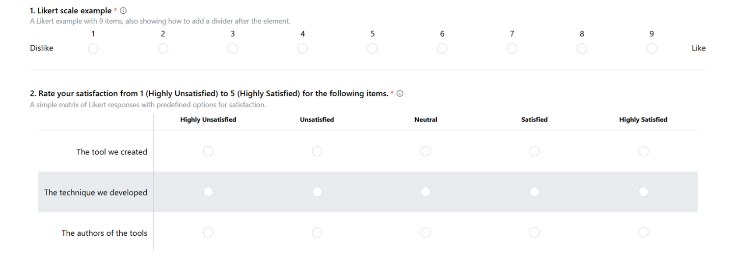
Dividers
You can structure your forms by adding a divider between form elements. This is useful when your study has multiple topics or transitioning between different types of tasks. To add a divider, add "withDivider": true to the question that you want the divider to appear after. In the following figure, there's a divider added between question 1 and 2.
"response": [
  {
    "id": "q-likert",
    "type": "likert",
    "numItems": 9,
    ...
    "withDivider": true
  }
]
Alternatively, if you want to position dividers independently of specific questions, you can use DividerResponse as a standalone response element.
"components": {
  ...
  "barChart": {
    ...
    "response": [
      {
        "id": "divider",
        "type": "divider"
      }
    ]
  }
}
Enumerating Questions
You can automatically number questions by setting "enumerateQuestions": true. This will prepend each question with its index number (starting from 1). This feature should only be used when all questions are in the same location (e.g., all questions are in the sidebar).

Radio and Checkbox Features
Radio buttons and checkboxes have some shared noteworthy features. Here is an example showing different configurations of radio buttons:
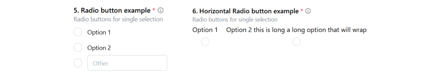
Vertical and Horizontal Layouts
Radios and checkboxes can be rendered either vertically (the default) or horizontally. The above figure shows radios for both. Set "horizontal": true to get the horizontal version.
"Other" Option
You can allow an "other" option for radios and checkboxes, as shown for the first radio group above. To enable that, set "withOther": true.
Selection Requirements for Checkboxes
For checkboxes, you can specify the minimum and maximum number of selections required using minSelections and maxSelections. These properties control how many options must be selected before the participant can proceed.
{
  "id": "checkbox-min",
  "prompt": "Select at least 2 options",
  "type": "checkbox",
  "options": ["Option 1", "Option 2", "Option 3", "Option 4"],
  "minSelections": 2
}
Matrix Features
Matrix questions let you ask several questions at the same time, using the same set of answer choices. You can either provide your own custom answers or use our built-in answer options.
Built-in options include:
likely5orlikely7: ranges from Highly Unlikely to Highly Likelysatisfaction5orsatisfaction7: ranges from Highly Unsatisfied to Highly Satisfied
Here is an example of Matrix Radio questions using "answerOptions": "likely7" and "answerOptions": "satisfaction5".
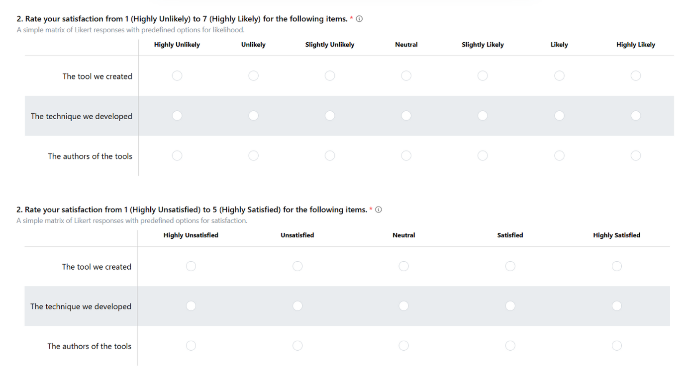
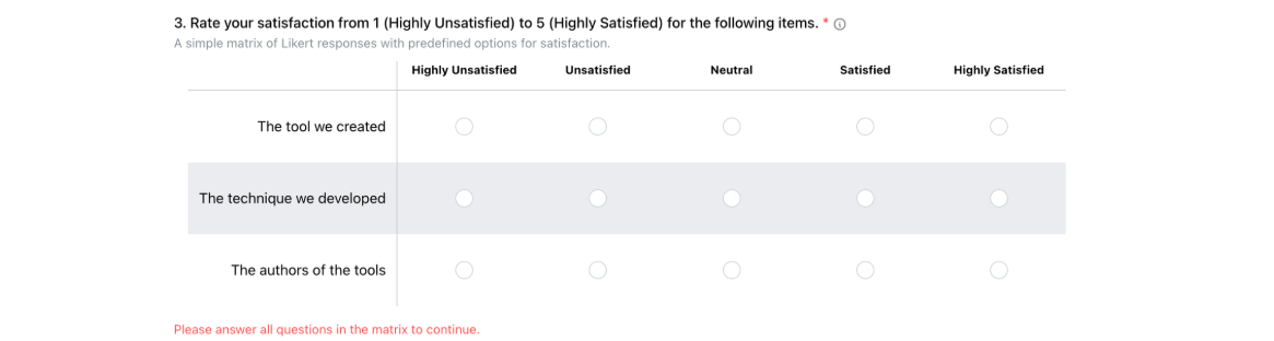
If any question in the matrix is left unanswered, participants will see a validation message: "Please answer all questions in the matrix to continue."
For matrix-radio and matrix-checkbox, setting "withDontKnow": true adds an "I don't know" column on the right side of the matrix, separated from the other answer options by a vertical line. In matrix-checkbox, selecting "I don't know" deselects any other answers in that row, and selecting any other option deselects "I don't know".
Dropdown Features
A dropdown allows participants to choose one or more from a list. By default, they can only pick one item. If you want to allow multiple selections, add minSelections or maxSelections and the dropdown will then automatically become a multiselect dropdown.
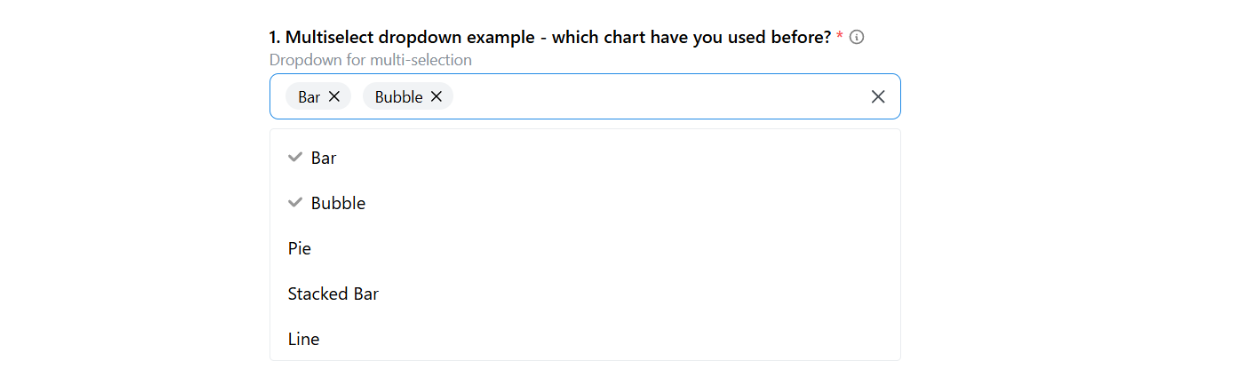
When minSelections or maxSelections are specified for a dropdown, it automatically becomes a multiselect dropdown, allowing participants to choose multiple options.
Example with minimum selections:
{
  "id": "dropdown-multi",
  "prompt": "Select at least 2 options",
  "type": "dropdown",
  "options": ["Option 1", "Option 2", "Option 3", "Option 4"],
  "minSelections": 2
}
Example with both minimum and maximum:
{
  "id": "dropdown-range",
  "prompt": "Select between 2 and 3 options",
  "type": "dropdown",
  "options": ["Option 1", "Option 2", "Option 3", "Option 4"],
  "minSelections": 2,
  "maxSelections": 3
}
Likert Features
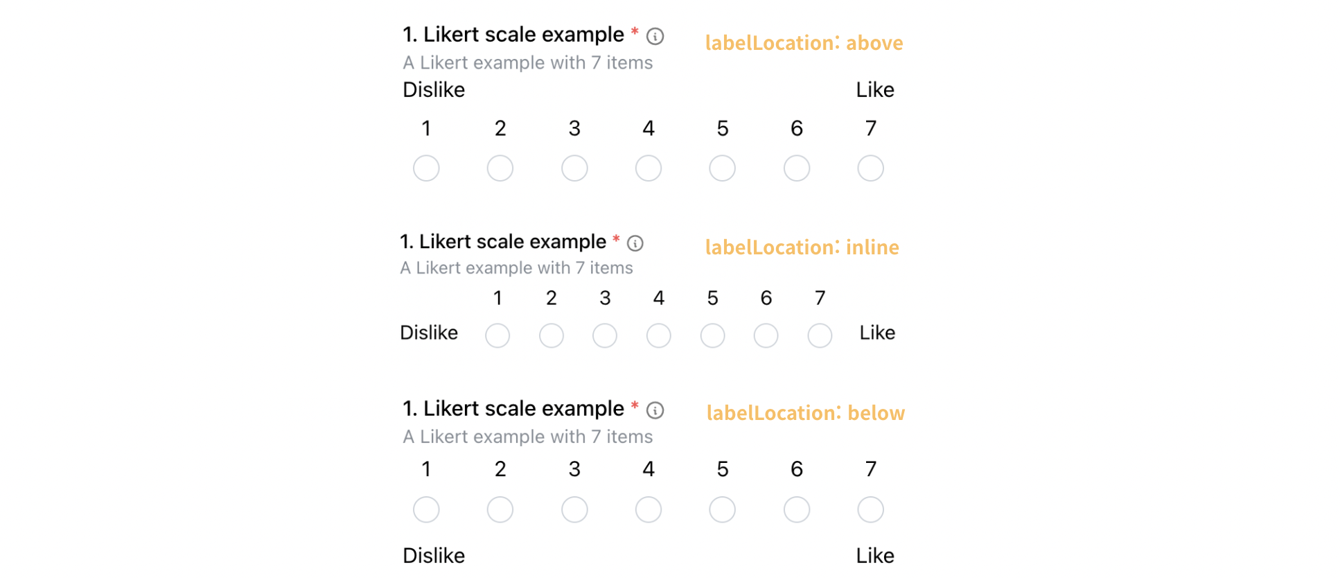
A Likert response allows participants to rate something on a scale. You can customize the scale in several ways -- you can set where the scale starts, how large the steps between values are, the label locations, and how many options it has.
For example, here is a Likert example with "start": 1, "spacing": 2, and "numItems": 10.

You can control the label location in Likert responses to better fit your layout. The labelLocation property supports multiple options: above, inline (default), and below. The above and below options are useful when the width of the section containing the Likert question is limited and the inline layout does not work well.
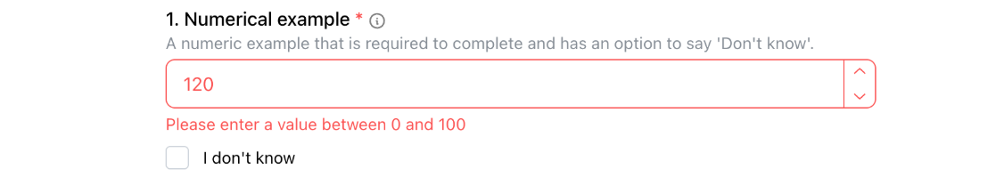
Numerical Response Features
Numerical response inputs support min and max fields that define the acceptable range of values for the answer. These constraints help ensure that participants provide values within the expected bounds, and warnings will be displayed if their input falls outside this range.
{
  "id": "q-numerical",
  "prompt": "Numerical example",
  "location": "aboveStimulus",
  "type": "numerical",
  "placeholder": "Enter your age, range from 0 - 120",
  "max": 120,
  "min": 0
}
The min and max properties work together to define a range. When participants enter values outside this range, they will see a warning message indicating the acceptable range.
You can also define a range of acceptable answers using the acceptableLow and acceptableHigh properties in the Answer interface. This is particularly useful for numerical answers where you want to accept values within a certain range rather than requiring an exact match.
{
  "correctAnswer": [{
    "id": "q-numerical",
    "answer": 5,
    "acceptableLow": 4,
    "acceptableHigh": 6
  }]
}
For example, if the correct answer is 5, and you set acceptableLow to 4 and acceptableHigh to 6, then any answer between 4 and 6 (inclusive) will be considered correct. This is useful for questions where there might be slight variations in correct answers, or where you want to account for rounding or measurement precision.
Slider Features
A slider response lets participants pick a value by moving a handle on a line. You can change how the slider works by setting where it starts, how big each step is, and how far apart the tick marks are.
Here is a slider example with "step": 10 and "spacing": 10.

You can also hide the label above the handle by using snap, and choose whether to show the bar with withBar.
The example below shows a slider with "snap": true and "withBar": false.

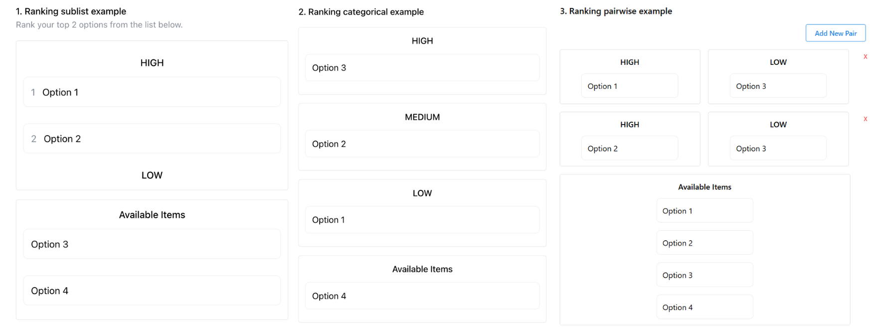
Ranking Widget Features
A ranking widget allows participants to order or group items rather than simply selecting them. They are useful when you want to capture relative preferences, priorities, or categories of interest.
The "numItems" option
For sublist and categorical rankings, you can use the numItems option to control how many items participants must assign:
- In a sublist,
numItemssets how many items they have to rank (e.g., top 2 out of 5). - In a categorical ranking,
numItemscan limit how many items may be placed in each category (e.g., only 3 items per category).
The numItems option cannot be used in pairwise rankings, since their purpose is to compare and rank items by pairs.
This option is useful when you want participants to focus on their strongest preferences rather than distributing all items.
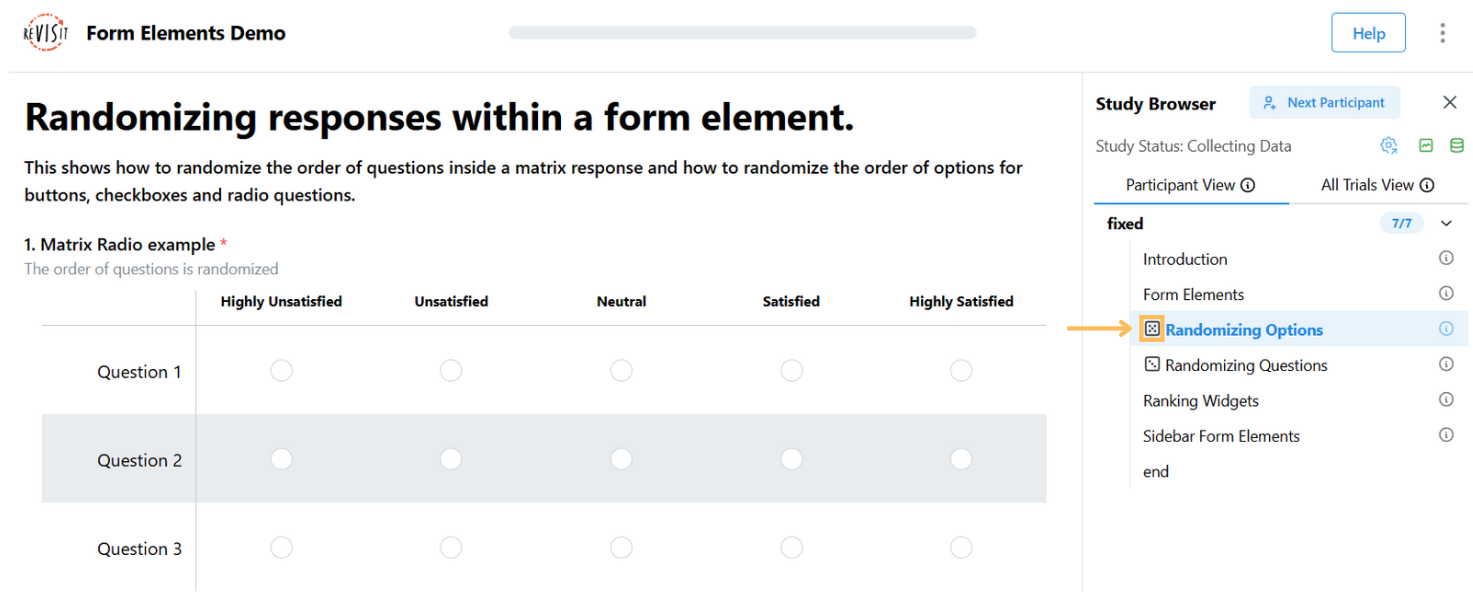
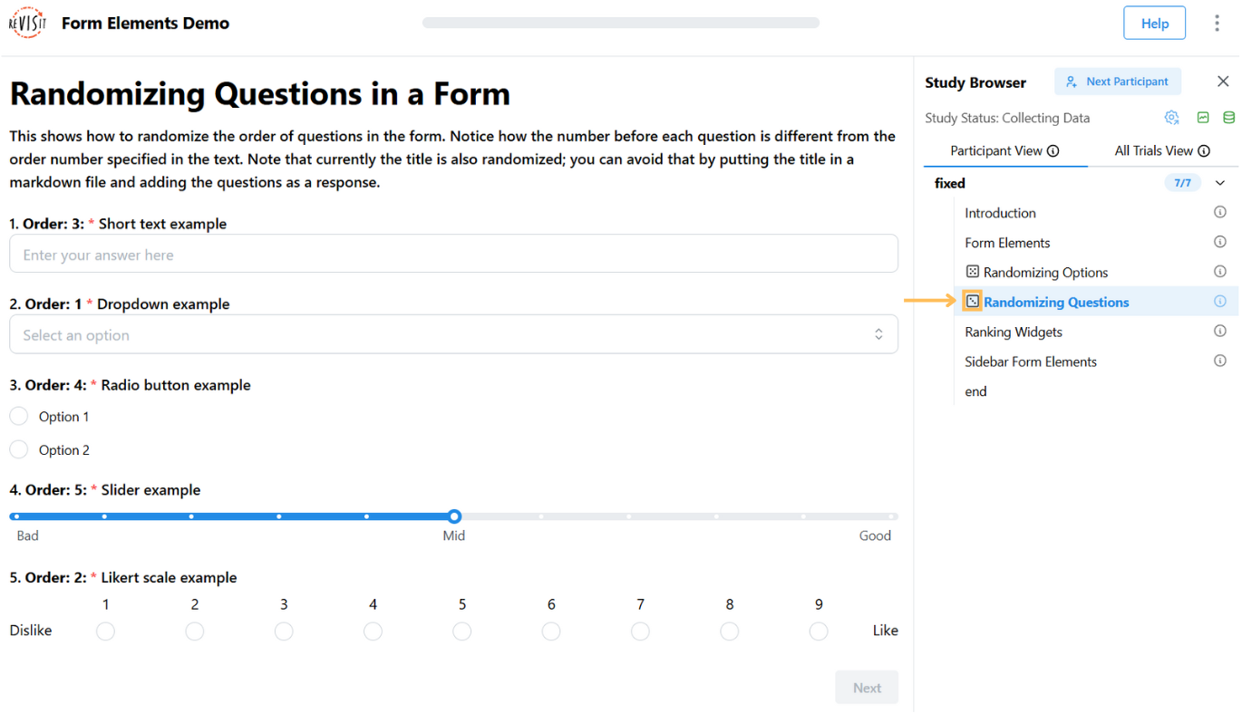
Randomization of form elements
Randomizing the order of answers or questions can help reduce bias and improve the quality of your study results. ReVISit allows you to shuffle options within a question, or even the order of entire questions on a page.
A die icon is shown in the sidebar to indicate that at least one item on this page has a randomized order.
Each participant will see their own consistent order during the study, and the same order is recorded and shown in the replay, so you can always see exactly what they saw.
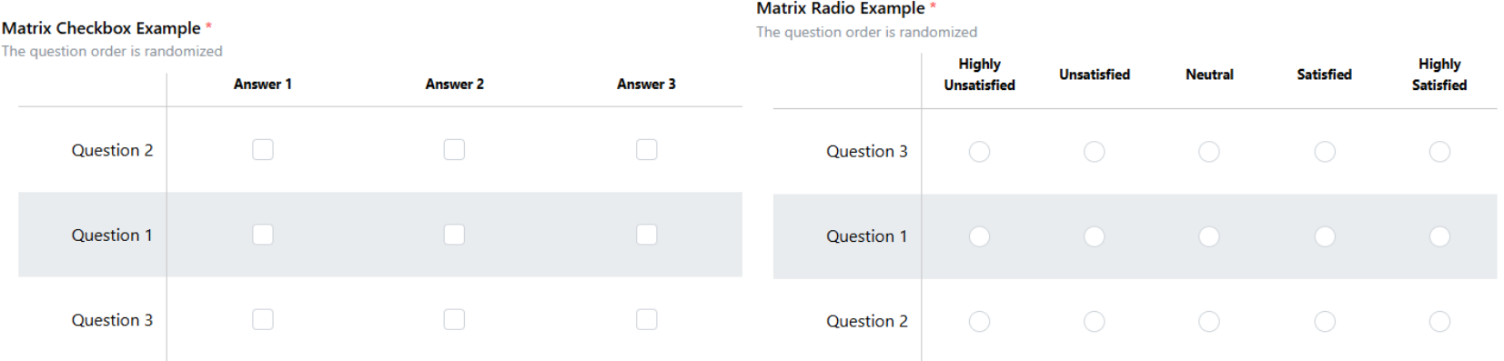
Randomizing Matrix Checkbox, Matrix Radio
For matrix questions (e.g., matrix radio or matrix checkbox), you can randomize the questions. Set "questionOrder": "random" to randomize questions.
Here is an example to show how to set up questions in random order:
"response": [
  {
    "id": "5items-response",
    "prompt": "To what extent do you agree that this visual representation is...?",
    "location": "belowStimulus",
    "type": "matrix-radio",
    "answerOptions": "satisfaction5",
    "questionOrder": "random", // Set randomization here
    "questionOptions": [
        "enjoyable",
        "likable",
        "pleasing",
        "nice",
        "appealing"
    ]
  }
]
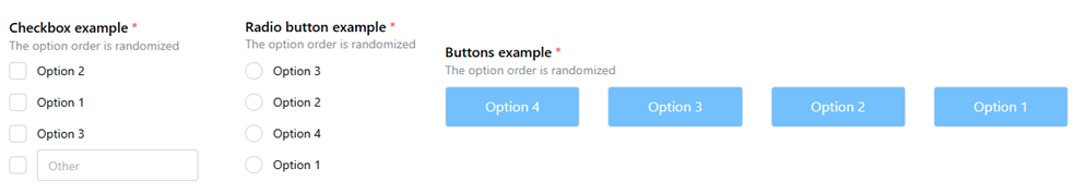
Randomizing Checkbox, Radio, Button
To shuffle the options in a radio, checkbox, or button question, set "optionOrder": "random".
Here is an example to show how to set up options in random order:
"response": [
  {
    "id": "fruitPreference",
    "prompt": "What’s your favorite fruit?",
    "location": "aboveStimulus",
    "type": "radio",
    "optionOrder": "random", // Set randomization here
    "options": [
        "Apple",
        "Banana",
        "Grape"
    ]
  }
]
Randomizing form elements in a single page
You can randomize the order of multiple questions that appear on the same page by setting "responseOrder": "random", which will shuffle the order in which the form elements themselves appear on the page. In some cases, however, you may want certain responses to stay in a fixed position. To exclude a specific response from randomization, set "excludeFromRandomization": true on that response element. This setting overrides the component-level responseOrder configuration and ensures the specified response maintains its original position while other responses are randomized.
Here is an example to show how to set up responses in random order:
"survey_randomized_form": {
  "type": "questionnaire",
  "responseOrder": "random", // Set randomization here
  "response": [
    {
      "id": "demographics",
      "prompt": "What is your gender?",
      "type": "shortText",
      "placeholder": "Enter your answer",
      "excludeFromRandomization": true // Exclude from randomization here
    },
    {
      "id": "duration",
      "prompt": "How long have you used this website?",
      "type": "shortText",
      "placeholder": "Enter your answer"
    },
    {
      "id": "favoriteFeature",
      "prompt": "What's your favorite feature?",
      "type": "shortText",
      "placeholder": "Enter your answer"
    },
    {
      "id": "recommend",
      "prompt": "Would you recommend our app?",
      "type": "dropdown",
      "options": [
        "Yes",
        "No"
      ]
    }
  ]
}
If the form is randomized, a die icon will appear in the sidebar to indicate that the response order is random.
Sidebar Configuration
The sidebar is a left panel that can be used to display form elements alongside your stimulus. This is particularly useful when you want participants to see both the stimulus and the questions simultaneously.
Enabling the Sidebar
To use the sidebar, you must set "withSidebar": true in your component or globally in the uiConfig. The sidebar is required if any of your responses have "location": "sidebar".
"components": {
  "survey": {
    "type": "questionnaire",
    "withSidebar": true,
    "response": [
      {
        "id": "q-sidebar",
        "prompt": "Rate this visualization",
        "location": "sidebar",
        "type": "likert",
        "numItems": 5
      }
    ]
  }
}
Sidebar Width
You can customize the width of the sidebar by setting "sidebarWidth" (in pixels). The default width is 300 pixels. This can be set globally in uiConfig or overridden on individual components.
"components": {
  "survey": {
    "type": "questionnaire",
    "withSidebar": true,
    "sidebarWidth": 400,
    "response": [
      {
        "id": "q-sidebar",
        "prompt": "Rate this visualization",
        "location": "sidebar",
        "type": "likert",
        "numItems": 5
      }
    ]
  }
}
For more details on sidebar configuration, see the UIConfig and BaseIndividualComponent documentation.