Applying Styles
ReVISit provides flexible styling capabilities to customize the appearance of your study components and responses. You can apply styles at three levels: globally through UI configuration, at the component level, and at the response level.
This comprehensive styling feature allows you to create accessible and visually appealing study interfaces that enhance the participant experience.
Styling Methods
There are two primary ways to apply styles to your study:
1. External CSS Files (stylesheetPath)
For comprehensive styling with complex rules, pseudo-classes, etc. across all components, you can load external CSS files.
"uiConfig": {
  "stylesheetPath": "study-name/assets/style.css"
}
When styling elements with external CSS files, target them using the appropriate selectors:
Class Selectors:
- Sidebar:
.sidebar - Study Browser:
.studyBrowser - Header/Title Bar:
.header - Main Content Area:
.main - Logo Image:
.logoImage - Study Title:
.studyTitle - Progress Bar:
.progressBar - Help Modal:
.helpModal - Component Container:
.componentType(e.g.,.markdown,.image) - Response type:
.responseType(e.g.,.textOnly,.likert) - Response Block Container:
.responseBlock - Response Block Container with Location:
.responseBlock-location(e.g.,responseBlock-aboveStimulus,responseBlock-belowStimulus) - Individual Response:
.response
ID Selectors:
- Component:
#componentName(e.g.,#introduction,#survey-question) - Response:
#responseId(e.g.,#final-feedback,#user-rating)
Styles are applied in the following order (later styles override earlier ones):
- Global UI Styles (
uiConfig.stylesheetPath) - Component Styles (
component.stylesheetPathandcomponent.style) - Response Styles (
response.stylesheetPathandresponse.style)
2. Inline Styles (style)
For basic styling like sizing, colors, and fonts, apply specific CSS properties directly to components or responses:
"component": {
    "style": {
        "width": "800px",
        "margin": "20px auto",
        "padding": "30px",
        "backgroundColor": "#96dcf5",
        "border": "1px solid #aeaeae",
        "borderRadius": "12px"
    }
},
UIConfig Styling
Using External CSS Files
Apply global styles that affect the entire study interface:
"uiConfig": {
  "contactEmail": "your@email.com",
  "logoPath": "study-name/assets/logo.svg",
  "withProgressBar": true,
  "withSidebar": true,
  "stylesheetPath": "study-name/assets/globalStyle.css"
}
Examples
Form style
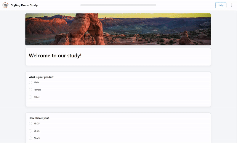
"uiConfig": {
  "stylesheetPath": "demo-style/assets/style/form.css"
},
.main {
  background-color: #f5f7fa;
}

.image {
  height: 200px;
  width: 80%;
  object-fit: cover;
  border-radius: 8px;
  box-shadow: 0 2px 8px rgba(0, 0, 0, 0.1);
  margin: 0 auto;
}

.responseBlock {
  display: flex;
  flex-direction: column;
  gap: 20px;
}

.response {
  width: 80%;
  background-color: #ffffff;
  margin: 15px auto 0;
  padding: 20px;
  box-sizing: border-box;
  box-shadow: 0 4px 12px rgba(0, 0, 0, 0.05);
  border: 2px solid #e3e8ed;
  border-radius: 12px;
}

label {
  margin-bottom: 10px;
}

#form-title p {
  font-size: 32px;
  font-weight: bold;
}
Large Text
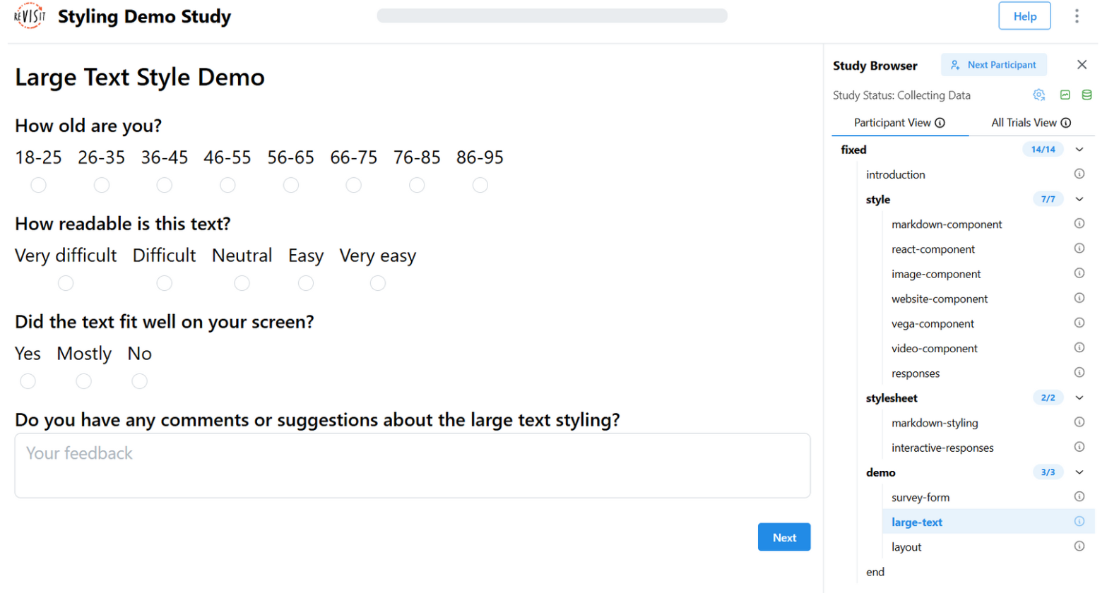
"uiConfig": {
  "stylesheetPath": "demo-style/assets/style/largeText.css"
},
.studyTitle {
  font-size: 24px;
  font-weight: bold;
}

.progressBar {
  min-height: 18px;
}

.response {
  margin-bottom: 40px;
}
.responseBlock p {
  font-size: 24px;
}

.responseBlock input,
.responseBlock textarea,
.responseBlock button {
  font-size: 22px;
}
Component Styling
Using External CSS Files
Components can load their own CSS files using stylesheetPath:
"markdown-intro": {
  "type": "markdown",
  "path": "study-name/assets/introduction.md",
  "stylesheetPath": "study-name/assets/componentStyle.css",
  "response": []
}
Example CSS file
You can select components with their name. For example, if your component name is markdown-intro, that will be the id in your CSS.
Use #markdown-intro to select your component. You can also use #markdown-intro code to select code elements inside that component.
If you would like to target all markdown components across your study, use the class selector .markdown.
.markdown {
  color: blue;
}

#markdown-intro {
  background: lightblue;
  border: 1px solid #ccc;
  padding: 20px;
  border-radius: 10px;
  margin: 20px auto;
  max-width: 800px;
}

#markdown-intro code {
  background: #f8f8f8;
  padding: 2px 4px;
  border-radius: 3px;
}
Using Inline Styles
Apply styles directly to component configurations:
"chart": {
  "type": "image",
  "path": "assets/chart.png",
  "style": {
    "width": "500px",
    "border": "2px solid #333",
    "borderRadius": "10px",
    "margin": "20px auto",
    "boxShadow": "0 4px 8px rgba(0,0,0,0.1)"
  },
  "response": []
}
Component Styling Examples
Markdown Component styling
"components": {
  "introduction": {
    "type": "markdown",
    "path": "study-name/assets/introduction.md",
    "stylesheetPath": "study-name/assets/style/introductionStylesheet.css",
    "response": []
  }
}
.markdown {
  background-color: #f1f1f1;
  padding: 30px;
  border-radius: 10px;
  margin: 20px auto;
}

#introduction h2 {
  font-family: "Gill Sans", sans-serif;
  font-weight: 700;
}

#introduction code {
  color: #0079cd;
}
Image Component Styling
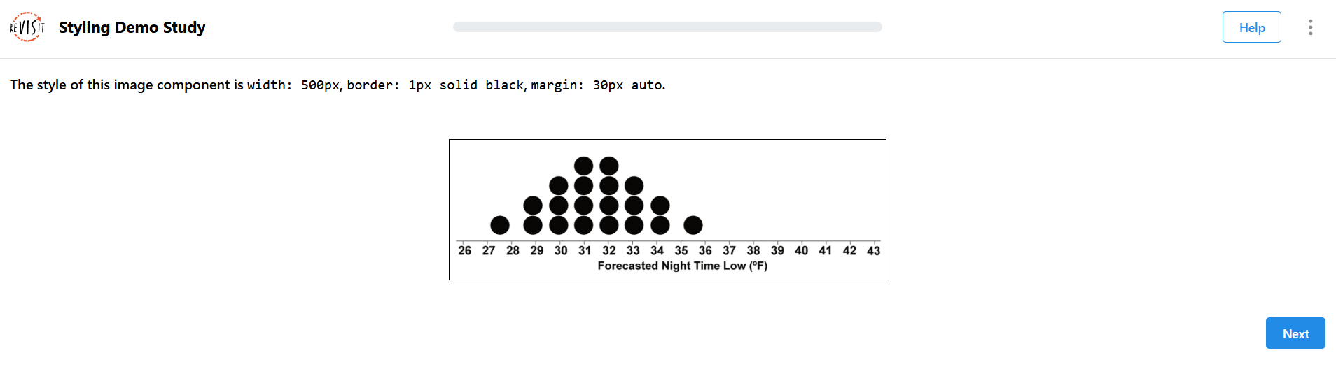
"components": {
  "chart": {
    "type": "image",
    "path": "demo-style/assets/image.png",
    "response": [
      {
        "id": "image-component-style",
        "prompt": "The style of this image component is `width: 500px`, `border: 1px solid black`, `margin: 30px auto`.",
        "type": "textOnly",
        "location": "aboveStimulus"
      }
    ],
    "style": {
      "width": "500px",
      "border": "1px solid black",
      "margin": "30px auto"
    }
  }
}
Vega Component Styling
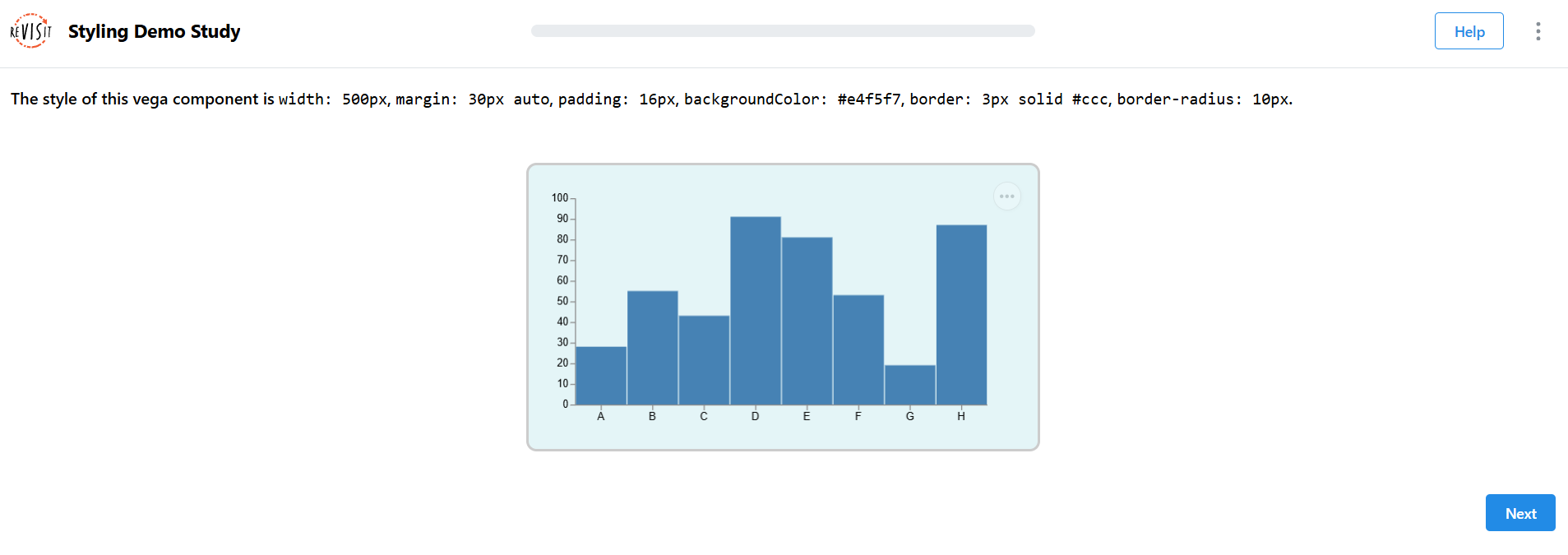
"components": {
  "vega-component": {
    "type": "vega",
    "path": "demo-style/specs/vegademo1.specs.json",
    "response": [
      {
        "id": "vega-path-component-style",
        "prompt": "The style of this vega component is `width: 500px`, `margin: 30px auto`, `padding: 16px`, `backgroundColor: #e4f5f7`, `border: 3px solid #ccc`, `border-radius: 10px`.",
        "type": "textOnly",
        "location": "aboveStimulus"
      }
    ],
    "style": {
      "width": "500px",
      "margin": "30px auto",
      "padding": "16px",
      "backgroundColor": "#e4f5f7",
      "border": "3px solid #ccc",
      "borderRadius": "10px"
    }
  }
}
Response Styling
Using External CSS Files
Responses can have their own stylesheets. You can target them using their type (as a class) or by their specific id.
- To select a specific response, use its
id(e.g.,#final-feedback). - To target responses by
type, use the class name (e.g.,.likert,.textOnly). - Use
.responseBlockto select the whole block that holds the responses. - Use
.responseto target any individual response element across the study.
"components": {
  "component": {
    ...
    "response": [
      {
        "id": "user-feedback",
        "prompt": "Rate your experience:",
        "type": "likert",
        "numItems": 5,
        "leftLabel": "Poor",
        "rightLabel": "Excellent",
        "stylesheetPath": "demo-style/assets/style/responseStyle.css",
        "location": "belowStimulus"
      }
    ]
  }
}
#user-feedback {
  background: #f8f9fa;
  border: 1px solid #dee2e6;
  padding: 15px;
  border-radius: 8px;
  margin: 10px 0;
}

.likert{
  background: #e9ecef;
  border-radius: 4px;
  padding: 8px 12px;
}
Using Inline Styles
Apply styles directly to response configurations:
"components": {
  "component": {
    ...
    "response": [
      {
        "id": "user-comments",
        "prompt": "Additional comments:",
        "type": "longText",
        "placeholder": "Share your thoughts...",
        "location": "belowStimulus",
        "style": {
          "width": "100%",
          "maxWidth": "600px",
          "margin": "20px auto",
          "padding": "15px",
          "border": "1px solid #ccc",
          "borderRadius": "6px",
          "backgroundColor": "#fafafa"
        }
      }
    ]
  }
}
Response Styling Examples
Text Response Styling
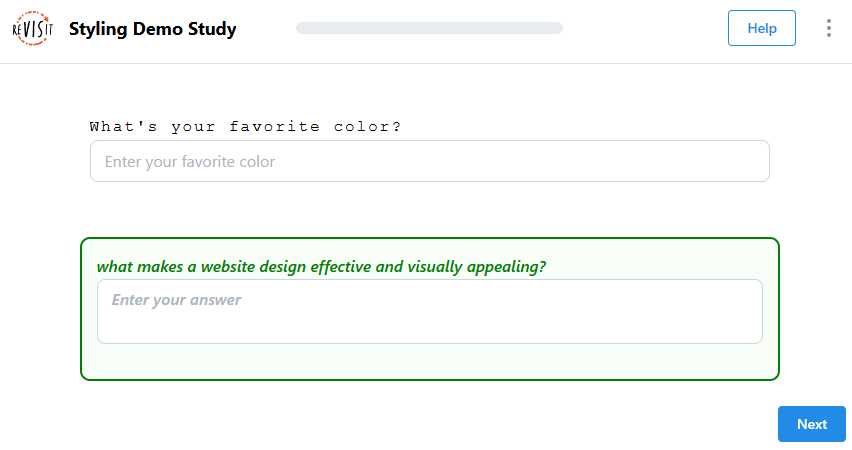
"response": [
  {
    "id": "short-text-response-style",
    "prompt": "What's your favorite color?",
    "type": "shortText",
    "location": "belowStimulus",
    "placeholder": "Enter your favorite color",
    "required": false,
    "style": {
      "fontFamily": "'Courier New', monospace",
      "width": "700px",
      "margin": "25px auto",
      "padding": "10px",
      "letterSpacing": "2px"
    }
  },
  {
    "id": "long-text-response-style",
    "type": "longText",
    "prompt": "What makes a website design effective and visually appealing?",
    "location": "belowStimulus",
    "placeholder": "Enter your answer",
    "required": false,
    "style": {
      "width": "700px",
      "margin": "25px auto",
      "padding": "15px",
      "border": "2px solid green",
      "borderRadius": "10px",
      "backgroundColor": "#f8fff9",
      "color": "green",
      "fontStyle": "italic",
      "fontWeight": "600",
      "textTransform": "lowercase"
    }
  }
]
Interactive Response Styling
You can also make responses interactive using CSS. For example, you can change the background color when a user clicks on a response. You might also make the text appear larger when the user starts typing. Adding interactions like these can improve the overall usability of your study.
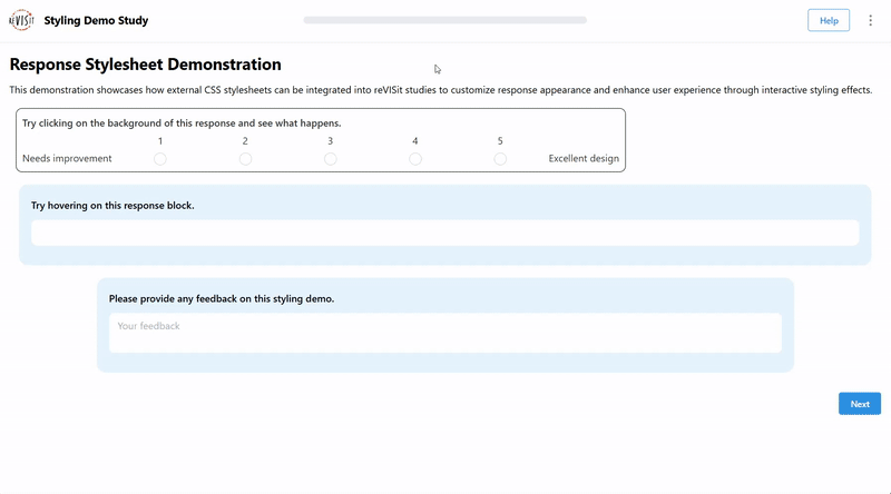
"interactive-responses": {
  "type": "markdown",
  "path": "demo-style/assets/responseStylesheet.md",
  "response": [
    {
      "id": "likert-response",
      "prompt": "Try clicking on the background of this response and see what happens.",
      "type": "likert",
      "location": "belowStimulus",
      "numItems": 5,
      "leftLabel": "Needs improvement",
      "rightLabel": "Excellent design",
      "required": false,
      "stylesheetPath": "demo-style/assets/style/responseStylesheet.css"
    },
    {
      "id": "short-text-response",
      "prompt": "Try hovering on this response block.",
      "type": "shortText",
      "location": "belowStimulus",
      "required": false,
      "stylesheetPath": "demo-style/assets/style/responseStylesheet.css"
    },
    {
      "id": "final-feedback",
      "prompt": "Please provide any feedback on this styling demo.",
      "type": "longText",
      "location": "belowStimulus",
      "placeholder": "Your feedback",
      "required": false,
      "stylesheetPath": "demo-style/assets/style/responseStylesheet.css"
    }
  ]
},
.responseBlock {
  display: flex;
  flex-direction: column;
  align-items: center;
}

#likert-response {
  border: 1px solid black;
  padding: 10px;
  border-radius: 10px;
  margin: 10px;
  width: 70%;
  color: #333333;
  transition: background 0.3s ease-in-out, color 0.3s ease-in-out, width 0.3s ease-in-out;
}

#likert-response:hover {
  width: 100%;
}

#likert-response:active {
  background: #000000;
  color: #ffffff;
}

#short-text-response {
  padding: 20px;
  margin: 15px;
  background-color: #e5f3fd;
  border-radius: 15px;
  transition: all 0.3s ease-in-out;
}

#short-text-response:hover {
  transform: scale(1.02);
  box-shadow: 0 15px 40px #9abddc;
}

#short-text-response input {
  border: none;
  border-radius: 10px;
  margin: 12px auto;
}

#final-feedback {
  width: 80%;
  padding: 20px;
  margin: 20px auto;
  background-color: #e5f3fd;
  border-radius: 15px;
  transition: all 0.5s ease;
}

#final-feedback textarea {
  border: none;
  margin: 12px auto;
  transition: all 0.3s ease;
}

#final-feedback textarea:focus {
  font-size: 20px;
  letter-spacing: 1px;
  transform: scale(1.01);
  animation: typing-glow 1.5s ease-in-out infinite;
}

@keyframes typing-glow {
  0%, 100% {
    box-shadow: 0 15px 40px #9abddc;
  }
  50% {
    box-shadow: 0 25px 80px #9abddc, 0 0 30px #9abddc, inset 0 0 20px rgba(154, 189, 220, 0.3);
  }
}